

Light & Dark Color System in Figma
TL;DR
Anchor every hue on tile 40.
Use predictable math for darker/lighter steps.
Lock names to the color, not the role.
Build Light & Dark modes in Variables, then let Figma do the heavy lifting.

Download Ready-to-use System
Why 8-step scales?
Eight tones per hue give you enough variety for text, backgrounds, strokes, states, etc., while still being small enough to maintain 10 → 80, where the higher number is the lighter tint.
Naming: keep it future-proof
Use the real hue in the name (gray40, purple20). Avoid UI-role names like backgroundPrimary. Roles can change; colors rarely do.
Skip dashes (gray40, not gray-40). Mirrors Xcode asset names without extra work.
Leave a “0” gap (gray40 not gray4). You can slip in future in-betweens like gray35
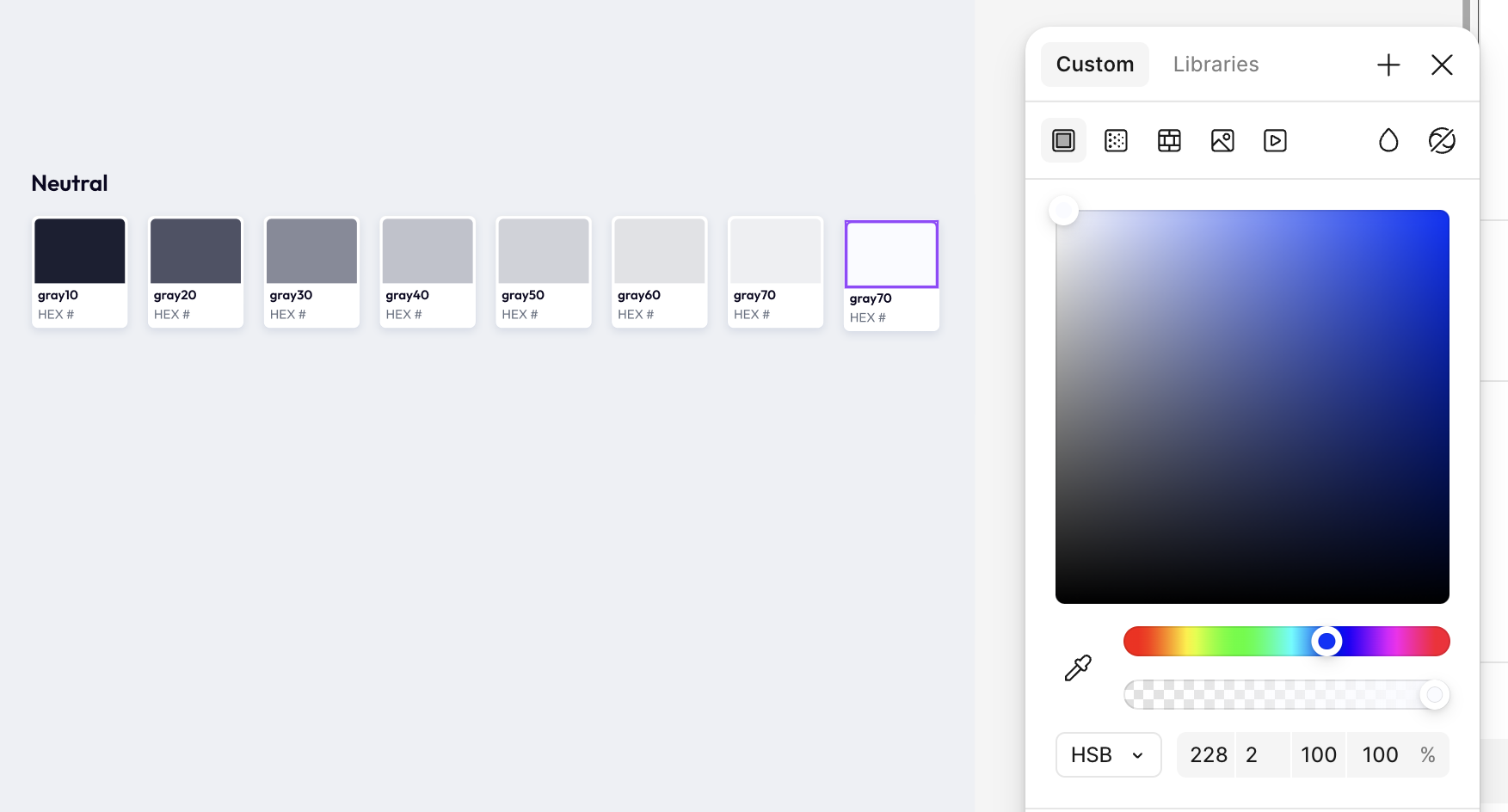
2. Building a Neutral (Gray) Scale
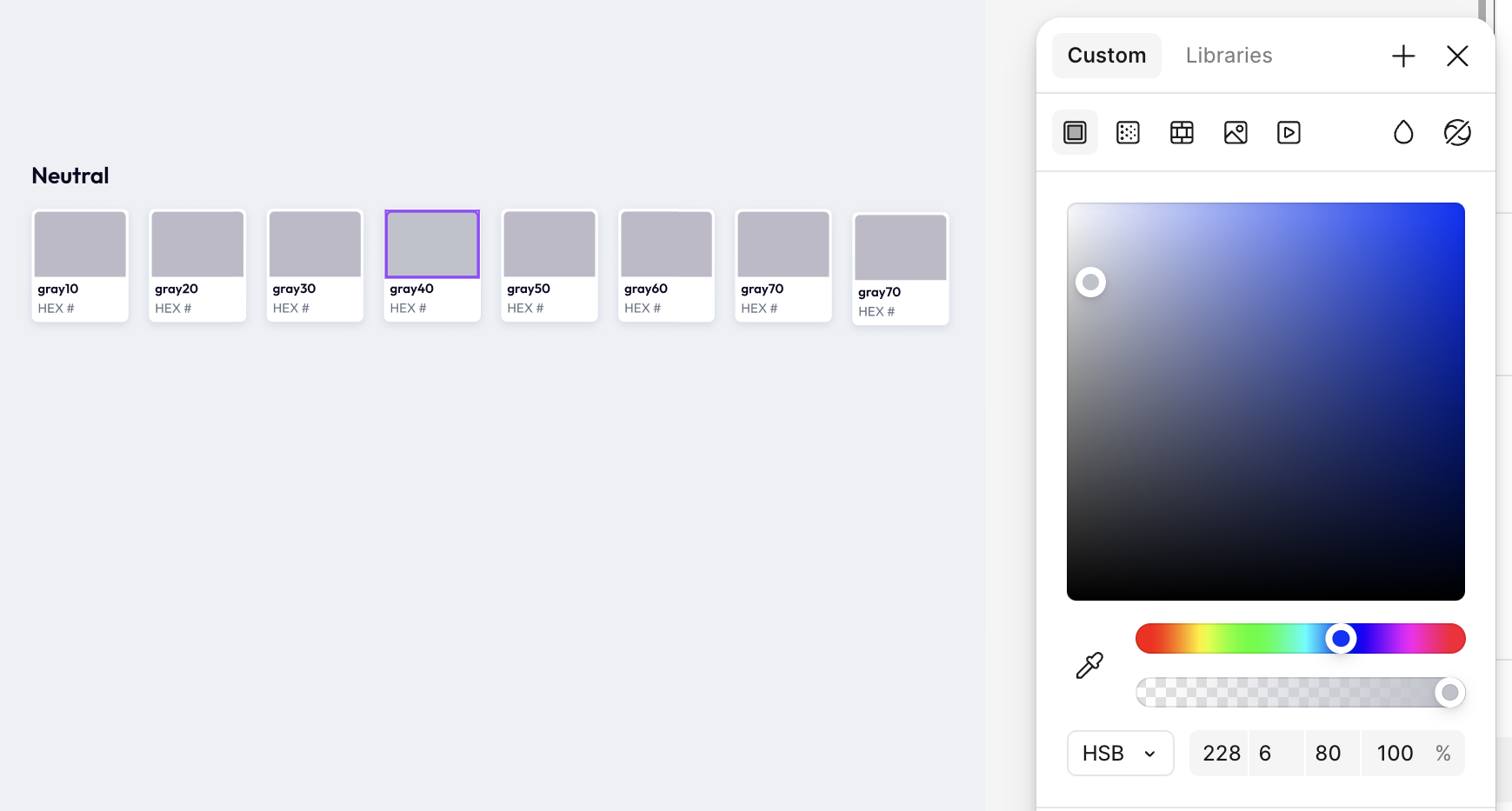
Color picker → HSB mode (Hue–Saturation–Brightness)
Create eight empty tiles in a row (10 → 80).
Tile 40 = Your anchor. Example:
Hue: 228° (adds a subtle purple bias)
Saturation: 8 %
Brightness: 80 %
Darker steps (30 → 10):
Move one tile left each time.
Double the Saturation and subtract 20 % Brightness per step.
30 → H 228 S 16 B 60
20 → H 228 S 32 B 40
10 → H 228 S 64 B 20
Lighter steps (50 → 80):
Start from tile 40 and move right.
-2 % Saturation, +5 % Brightness per step.
50 → H 228 S 6 B 85
60 → H 228 S 4 B 90
70 → H 228 S 4 B 95
80 → H 228 S 2 B 100
Switch back to HEX and copy the codes into the tiles.

3. Building a Chromatic (Primary) Scale
Duplicate your eight placeholders.
Tile 40 = Anchor
Example purple: H 261 S 52 B 82.Darker steps: keep Saturation, drop Brightness by 20 % each time.
30 → B 62 | 20 → B 42 | 10 → B 22Lighter steps: drop Saturation 10 %, raise Brightness 10 % each step.
50 → S 42 B 92
60 → S 32 B 100
70 → S 22 B 100
80 → S 12 B 100HEX-out and fill the tiles.
Tip: You’ll notice the jumps are smaller on the chromatic scale so the bright tints stay vibrant instead of pastel.

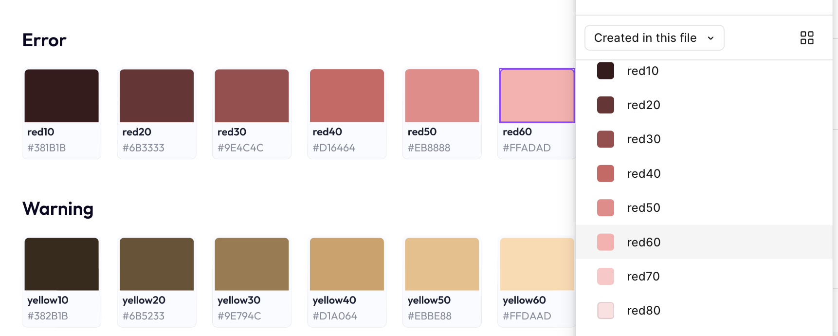
4. Expanding the Palette Quickly
Copy the entire primary set.
Only change the Hue:
Red (Error) ≈ 0°–15°
Yellow/Orange (Warning) ≈ 30°–45°
Green (Success) ≈ 140°–160°Because Saturation/Brightness deltas stay identical, every color “feels” related.

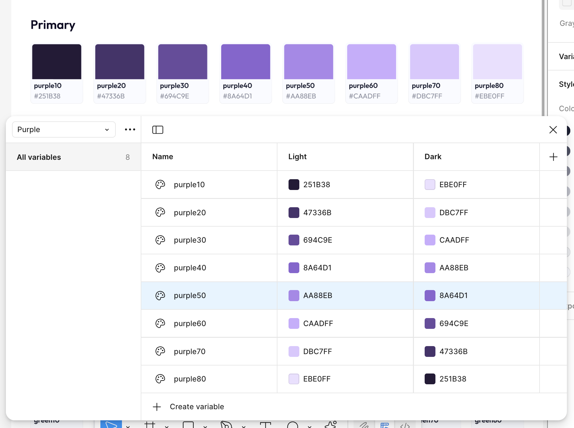
5. Creating Light & Dark Variables
Click blank canvas › Design panel → Variables.
New collection → name the color.
+ Create variable → Color and add all eight names per hue.
Add variable mode → rename to Light (Mode 1) and Dark (Mode 2).
Paste the HEX codes for the Light mode.
Mirror / tweak the HEX codes for Dark (e.g., swap 10 ↔ 80, 20 ↔ 70, etc.).
Re-apply variables to your tiles (select → right-click → Apply variable).
Frame Appearance = Light. Duplicate the frame,
Set Appearance = Dark to preview the automatic switch.
Need a custom color palette—or have questions?