0→1iOSmacOSSwiftUIUser ResearchAI-assistedApp Store · Live
A track-day notebook for motorcycle riders that knows the circuit:
38 real tracks with a computed reference line, a session logbook
built for one-handed use between sessions, and a Mac companion for
the analysis that happens the day after. I owned the whole thing,
from identifying the rider and the problem, through 16 interviews
and a TestFlight beta, to the SwiftUI build and the App Store
launch — in one month, as a solo founder working with AI.
~500Downloads · first month
200MAU
20%Free → Pro conversion
Credits
Team and role.
Founder & Product Designer
ICP definition and problem framing, 16 rider interviews, 9 coach conversations, a rider survey and community research, competitor teardown, information architecture, UX/UI across iOS and macOS, design system, prototyping, usability and beta testing.
Developer
SwiftUI development across iOS and macOS, SwiftData with iCloud sync, SceneKit 3D, StoreKit 2 subscription, TestFlight beta, App Store release, marketing site and launch plan.
AI collaborator
Claude, used throughout as a research analyst, market verifier, design-system generator, and pair programmer — directed and reviewed by me at every step.
Apex Lines is the study-and-logging half of a motorcycle track day.
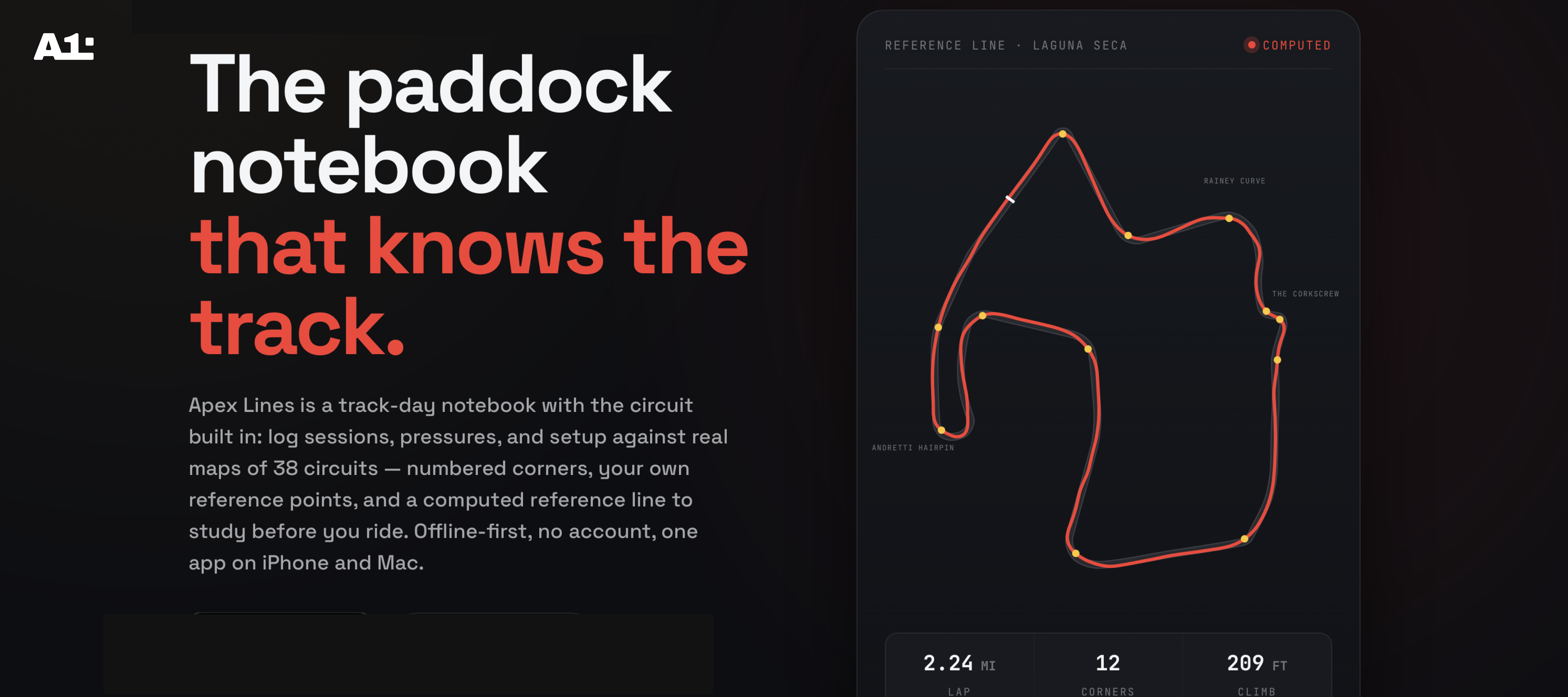
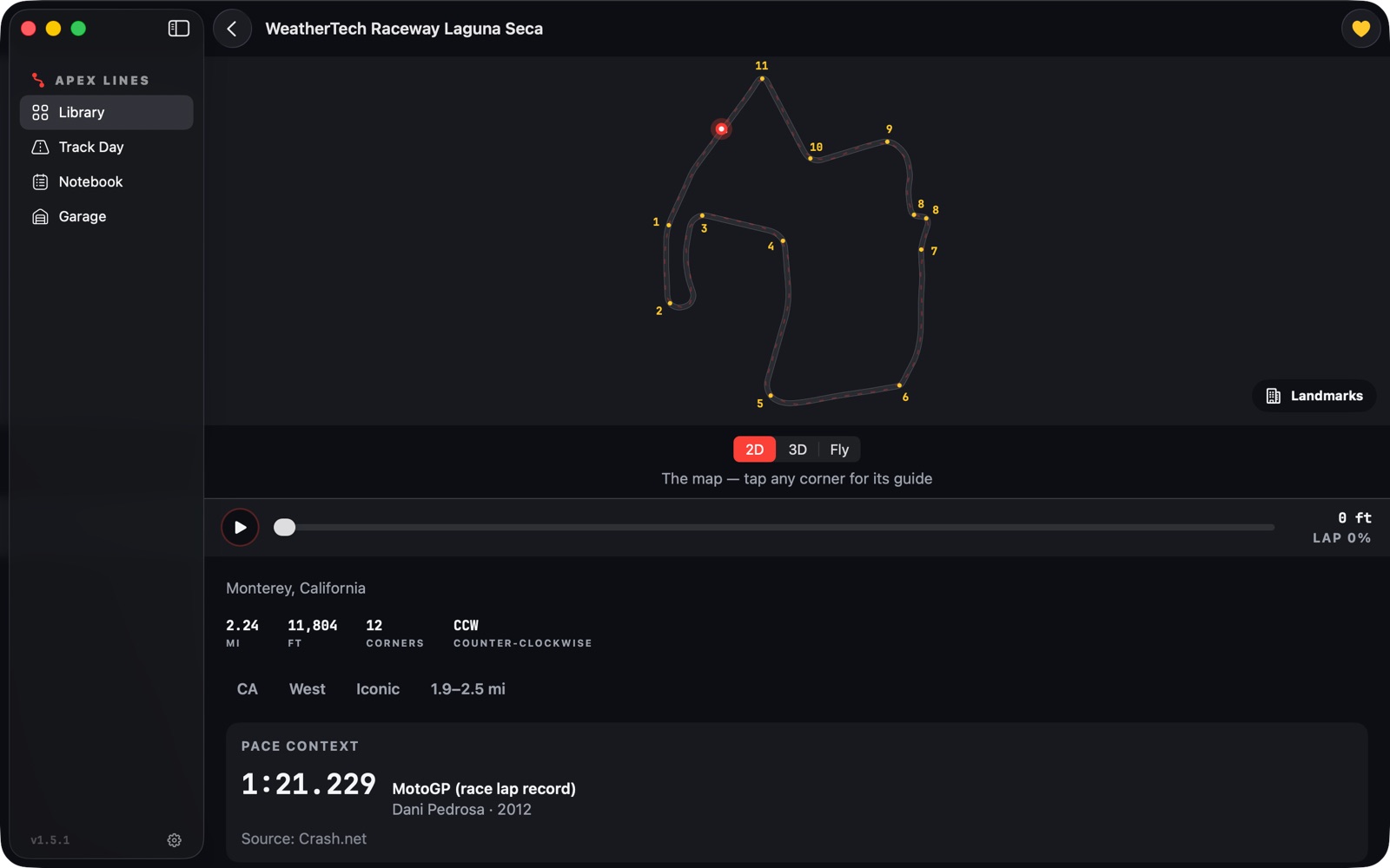
Before the day, a rider walks the circuit on a real map with
numbered corners, a computed reference line, and per-corner guides.
Between sessions, they log lap times, tire pressures, weather, and
corner notes with one hand. The day after, the same notebook opens
on the Mac as a three-pane logbook with lap trends, personal bests,
and a Garage that turns logged ride time into engine hours and
tire heat cycles. Offline-first, no account, one subscription
across iPhone and Mac.
The challenge
Every track app was built for cars, and for the wrong moment.
I ride track days myself, and the app I wanted did not exist. The
incumbents are live lap timers built around car HPDE: they want
your attention while you are on the bike, they assume a mounted
phone and hardware, and their notes are an afterthought. A rider
in a paddock has gloves on, a session in twenty minutes, and a
logbook that is still paper. The brief was to design for the
moments a lap timer never sees: the night before, the ninety
seconds between sessions, and the day after.
“Riders want to spend their time riding. The app's job is to be
brilliant before the day and after it, and almost invisible during
it.”
Process · Discovery
From a paddock hunch to a defined ICP.
The idea started as my own frustration, so the first job was to
find out whether it was only mine. I began with casual paddock
conversations to test one assumption: that there was no
high-quality logbook built for motorcycle riders. Once that held,
I ran 16 structured interviews with riders across
the experience curve, from first-track-day novices to advanced
group regulars, 9 conversations with track-day
coaches, a rider survey for qualitative feedback at scale,
and several weeks of reading how riders actually talk about tools
in track-day forums and groups.
Three findings shaped everything that followed.
The market is car-first. Almost every app riders
had tried was designed around car track experiences, and the
motorcycle-specific details (tire pressures per wheel, gearing,
heat cycles, gloves) were missing or awkward.
Riders want to ride, not tap. The meaningful time
with an app happens before the track day and the day after it, not
during.
Trackside use is quick checks only. Between
sessions a rider has a couple of minutes, one free hand, and no
patience for forms.
Defining decision
Design for three moments, not one app. The night before gets
planning, checklists, and study material. The paddock gets a
one-handed logger that captures a session in under ninety
seconds. The day after gets a full logbook on the Mac with charts
and setup recall. Same data, same components, a different shell
for each moment. This one decision set the information
architecture, the platform split, and the free tier.
The first user interview was with myself. Every later one was with a rider who had the same paper logbook in the van.
Process · Product thinking
Position against the lap timers, then price like it.
A verified competitor teardown of RaceChrono, Harry's LapTimer,
and APEX Pro confirmed the wedge: every incumbent is a live lap
timer, and nobody owned pre-ride study or the logbook. Apex Lines
would never claim to be a faster timer. It would be the tool your
lap timer is missing, motorcycle-first everywhere, and honest
about being study material rather than coaching.
The business model followed the research rather than the other way
around. Freemium subscription apps convert a small single-digit
share of installs, which vetoed paid acquisition and made a
genuinely useful free tier the growth engine: every circuit and
every reference line free, the first track day free, Pro for the 3D
fly-through, corner guides, and the unlimited notebook. I also
committed to a privacy promise the audience cares about: no
account, no analytics SDK, attribution through App Store campaign
links only. That promise shaped the launch plan as much as the
product.
What stays free: every circuit, every numbered corner, and the computed reference line on the 2D map. Pro opens 3D, fly-the-line, and the corner guides.
Process · AI-assisted design and build
One designer, one month, a shipped product.
I built Apex Lines alone, with Claude as a collaborator in every
phase. This is worth being precise about, because it is the reason
a designer could take an idea from research to the App Store in a
month without a team.
Research and market analysis. I used Claude to
synthesize interview notes and survey responses into themes, to
run a multi-source market investigation, and to adversarially
verify every number in the launch plan against primary sources.
Claims that did not survive verification were marked as
unverified and never made it into a decision.
Design system. The brand palette, type scale,
spacing, and shared components (readouts, steppers, condition
chips, the timecode field) were generated as SwiftUI code from my
design direction, reviewed, and refined in Xcode previews rather
than in static mockups.
Prototypes and build. Each milestone was specified
by me as a written design spec, built with Claude as pair
programmer, and verified with simulator screenshots and deep-link
QA routes before the next one started. When two proposals
conflicted, I resolved them with a documented pick, not a hedge.
The division of labor stayed the same throughout: I owned the
rider, the problem, the priorities, and every design call. AI
collapsed the distance between a decision and a working screen
from days to minutes, which meant more of the month went to
testing with riders and less to production.
Design · UX/UI
Designed for gloves, sun glare, and ninety seconds.
The paddock persona set the interaction rules for iPhone: thumb
reach, large targets, haptic confirmation, and undo everywhere. Lap
times are entered in a stopwatch-style timecode field where digits
fill in place, so a rider types 14732 and reads 1:47.32 without
ever seeing a keyboard modal. Tire pressures and gearing use
steppers instead of text fields. Corner notes are pinned by
tapping the corner on a mini map, not by typing its name. Every
motion token is gated on Reduce Motion.
The visual language borrows from the pit wall: racing red for the
reference line, apex amber for the point that matters, a
monospaced readout face for numbers, and dark ink surfaces that
survive direct sunlight. The app icon, a late-apex line sweeping a
single corner, is generated from the same geometry the app draws.
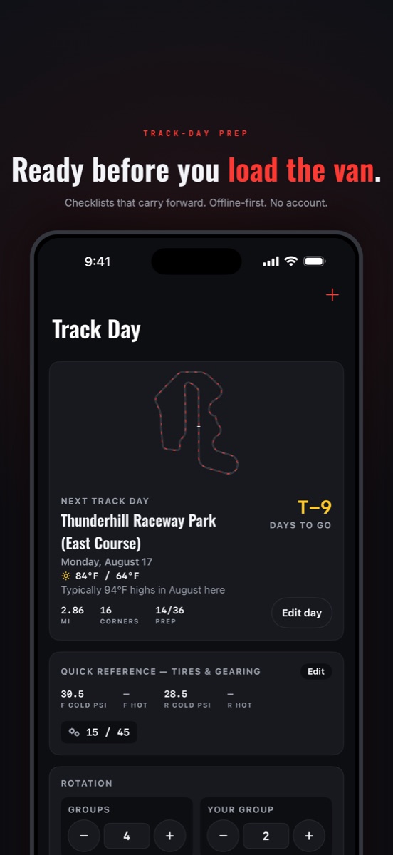
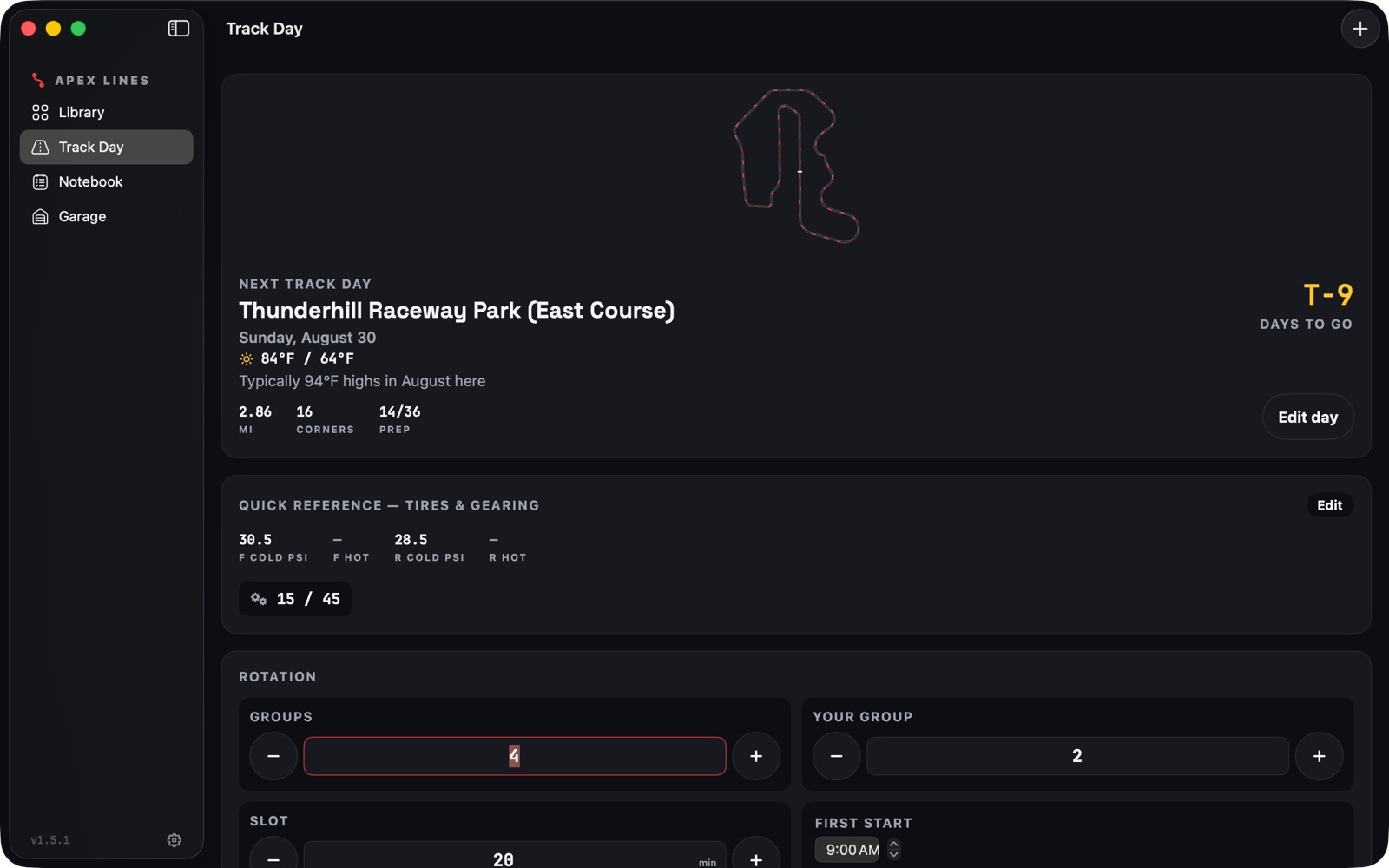
Track-day prep: steppers for rotation and pressures, and a countdown that reads at arm's length
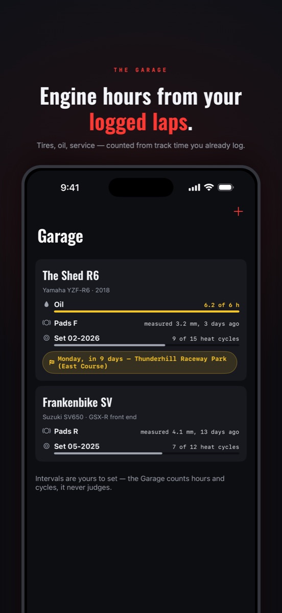
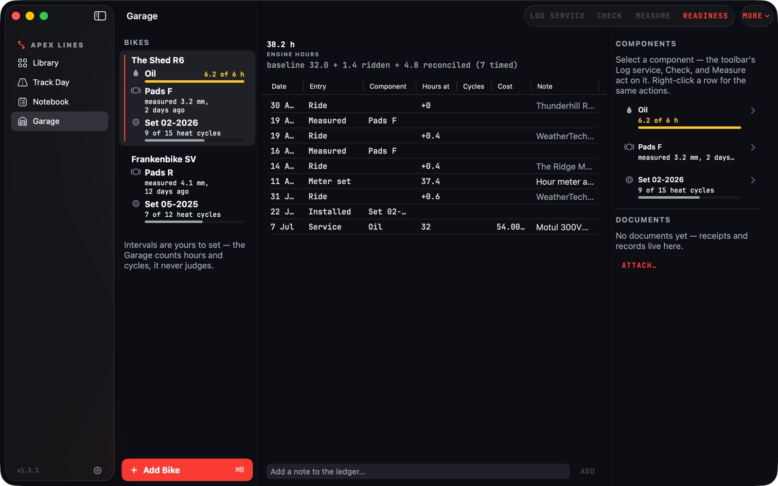
The Garage: monospaced readouts on dark ink, amber only for the number that matters
Features
Four things the product does.
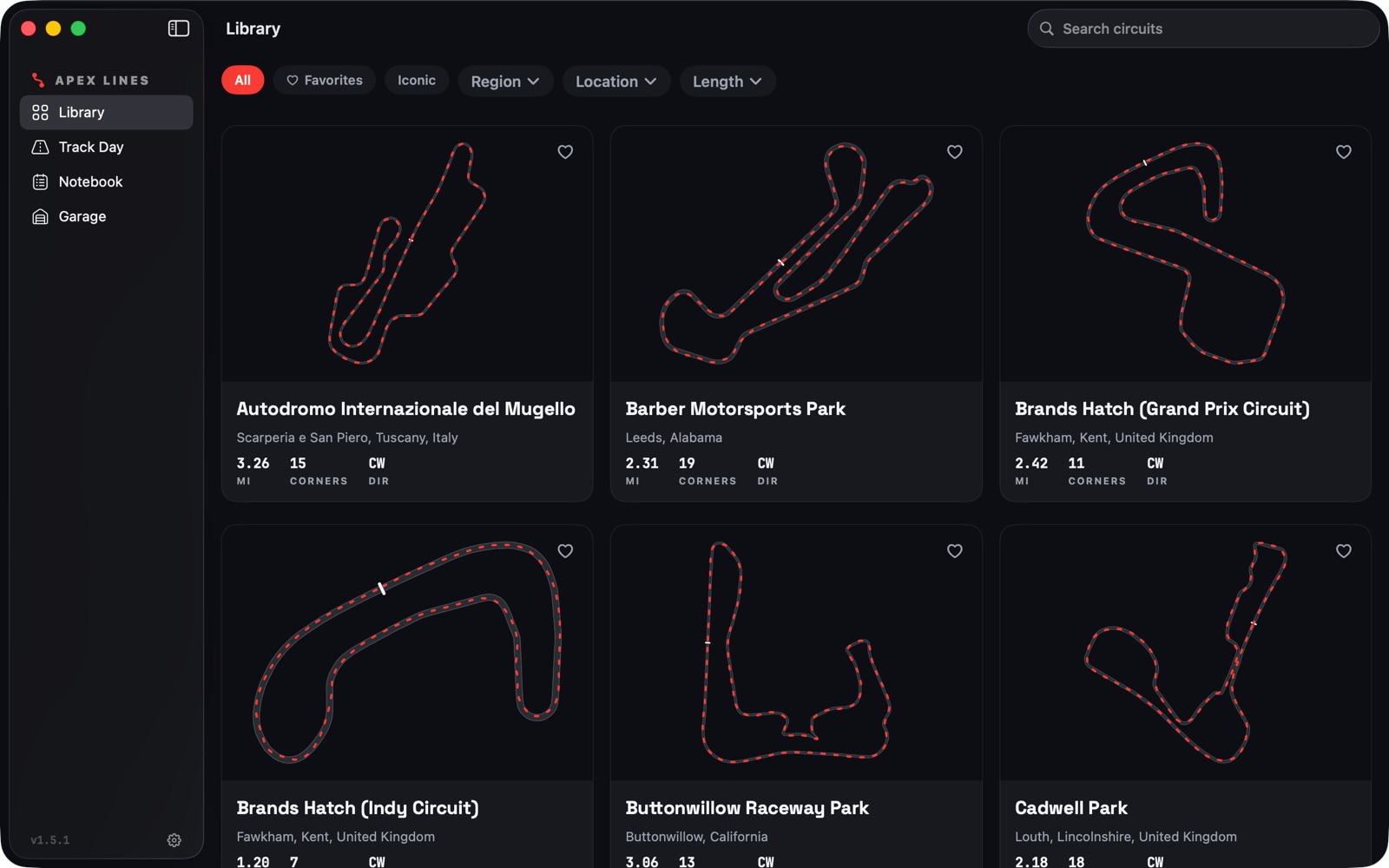
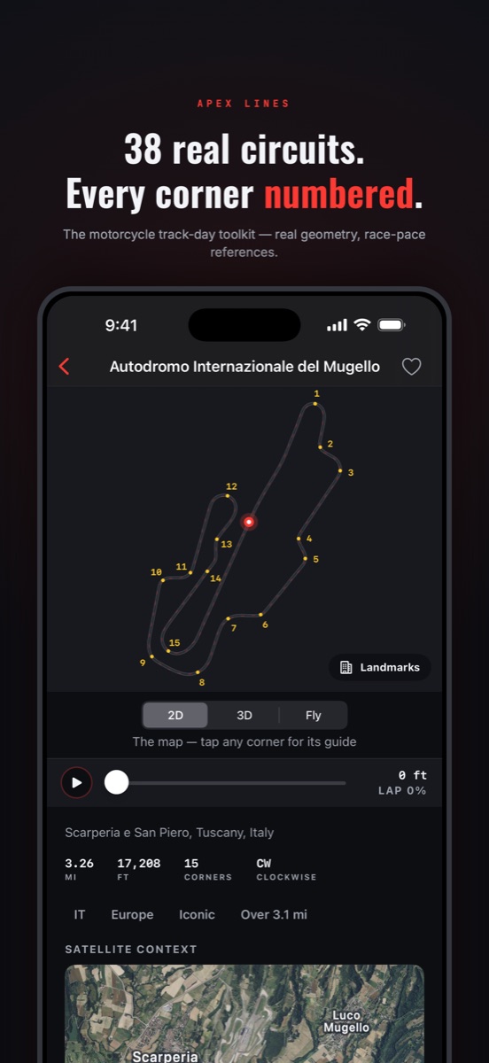
38 real circuits, every corner numbered
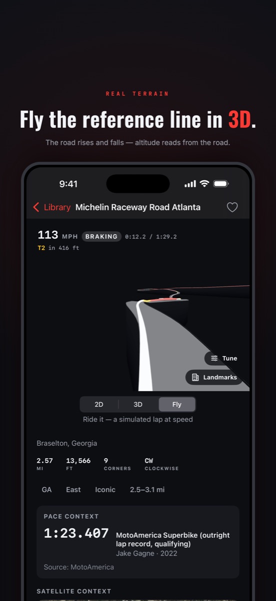
Fly the reference line in 3D with a live HUD
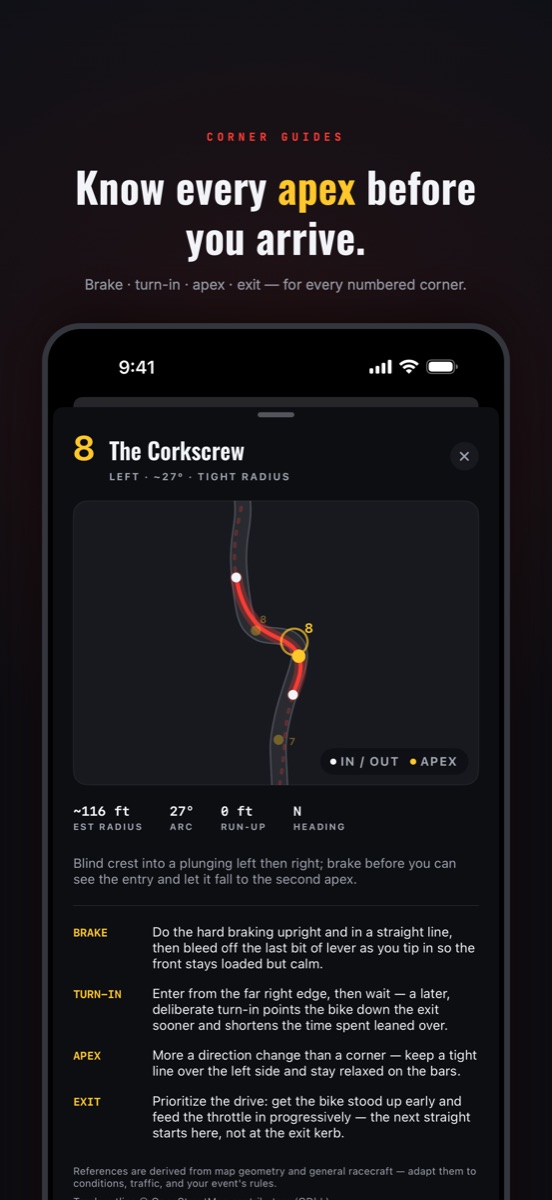
Every corner briefed: brake, turn-in, apex, exit
01
Circuits with a computed reference line
38 real US circuits from OpenStreetMap geometry, with numbered
corners and a reference line solved from the pavement itself
by minimum-curvature optimization. Apexes are geometrically
real, not hand-drawn, and the line can never leave the
asphalt.
02
A notebook that lives at the track
Track days hold sessions, sessions hold laps. Cold and hot
pressures per wheel, weather auto-filled from Apple Weather,
per-corner notes, lap trend charts with personal bests, and
setup recall the next time you return to a circuit.
03
3D fly-the-line and corner guides
Every circuit renders as a 3D scene. Fly mode runs a
physics-flavored lap over the line, braking into corners and
driving out, with a live HUD. Each corner gets a guide with
radius, run-up, and brake, turn-in, apex, and exit references
derived from the line's curvature.
04
Planning and the Garage
Prep checklists, run-group timers, overnight plans with a
security checklist, and a shareable setup card. The Garage is
a maintenance ledger keyed to logged track time: engine hours
and tire heat cycles accrue from the sessions you already
logged, with cited service intervals you accept or edit.
Solution · Feature deep-dive
The ninety-second session logger.
The logger is the product's answer to the second research
finding. It opens as a bottom sheet with the lap field already
focused, a number pad instead of a keyboard, and the previous
session's pressures carried forward so the rider only edits
what changed. Each saved lap gets a haptic tap; a new personal
best gets a pulse.
Everything is undoable from a toast, so a gloved mis-tap costs
nothing. When the rider comes back to the same circuit months
later, the day header reads their last setup back to them:
"Last time here: front 30.0 → 33.5." The notebook pays the
rider back for filling it in.
Cross-platform
One notebook, two shells.
The data model, units, charts, and most components are shared
between iPhone and Mac. Only the shell and the input affordances
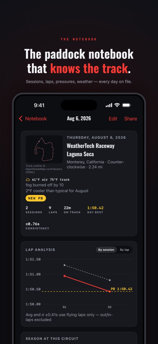
diverge. On iPhone the notebook is a navigation stack tuned for one
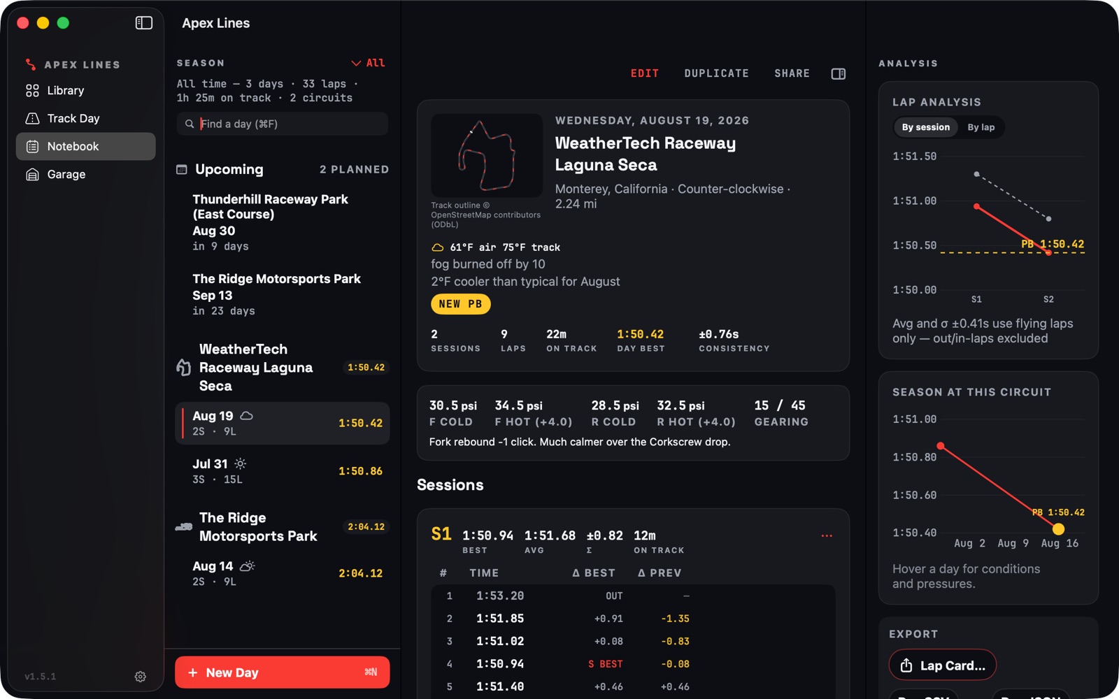
hand. On the Mac it becomes a three-pane logbook: a season sidebar,
a lap table with deltas to best and previous, and an inspector for
analysis and export, driven by keyboard shortcuts. iCloud sync
carries a day logged trackside to the Mac by the time the rider
gets home. The free tier never hides synced data: the cap is on
creating new days, never on seeing your own.
Mac: season sidebar, day sheet with lap table, analysis and export inspector
iPhone: the same day, read one-handed
Process · Validation
Nine riders on TestFlight before anyone else.
The first complete build went to a closed TestFlight beta of
9 riders drawn from the interview pool, so the
people who had described the problem were the first to judge the
answer. I asked each of them to use it for a real or simulated
track day and to talk through the notebook the day after.
The beta did three things. It surfaced the initial bugs and
rough edges that only real devices and real data expose. It drove
a round of UI quality work: a custom icon set, transitions and
animations on list inserts and chart reveals, and polish on the
library cards, which went through four iterations before the map
became the card. And it added a feature. Talking through the notebook
with testers kept landing on the same paddock question, "how many
hours are on this oil?", so the Garage, a maintenance ledger fed by
the sessions riders were already logging, was designed and built
during the beta and shipped in 1.0.
Beta polish pass: custom icons, motion, and the prep hub on Mac
Added during the beta: the Garage, a maintenance ledger fed by logged sessions
16Rider interviews
9Coach conversations
9TestFlight beta riders
1 moResearch → App Store
Implementation · Launch
Shipped August 31, 2026.
Launch was treated as part of the design, not an afterthought.
Because the app collects no analytics, measurement had to be
designed in: App Store campaign links per channel, offer-code
batches per partner, and cookie-free redirect counting on the
marketing site. The go-to-market leaned on zero-cost levers the
research had validated, App Store optimization into the "racing
line" and "track day notebook" gap, partnerships with track-day
organizations already listed in the app, and a YouTube library of
corner-by-corner track guides, with a single capped Apple Search
Ads test as the only paid spend. The marketing site shipped
alongside the app with written guides for 19 circuits and an
in-browser racing-line lab as free, shareable entry points.
“First app that actually gets what a track day is for a rider.
I punch in my laps between sessions with my gloves half on, and
the next weekend it tells me what pressures I ran last time.
My paper logbook is retired.”
Sam M. · Track-day rider · Intermediate group
“I send students to the corner guides before they show up. Being
able to walk the line on a map and then see it fly in 3D makes
the debrief so much faster. It is study material done right.”
Scott D. · Track-day coach
Outcomes
What shipped, what moved.
20% → Pro
Free-to-Pro conversion in the first month after launch, against
a freemium-app benchmark in the low single digits. The free tier
earns trust; the notebook earns the subscription.
~500Downloads · first month, zero paid acquisition
200Monthly active riders
38Circuits · real geometry, computed line
Stack
Tools and methods.
User interviewsSurveyCompetitor teardownTestFlight betaSwiftUISwiftData + CloudKitSceneKitSwift ChartsStoreKit 2WeatherKitXcodeClaudeAccessibility
“The month was not fast because I skipped steps. It was fast
because every step produced a working thing riders could react
to, and AI made the gap between a decision and a screen almost
disappear. The judgment still had to be mine.”