Branding Through Interface
For a digital product, the interface is not where the brand gets applied — it's where the brand gets built. This post maps the six channels a brand speaks through inside a web or mobile app, shows why Duolingo, Headspace, Stripe, Linear, and Mailchimp are the products worth studying, and ends with a working checklist — one version for a first launch, one for a product people already trust.
• Treat the interface as the brand's primary medium.
Users spend seconds with your logo and hours with your product —
perception is built in the UI, not the campaign.
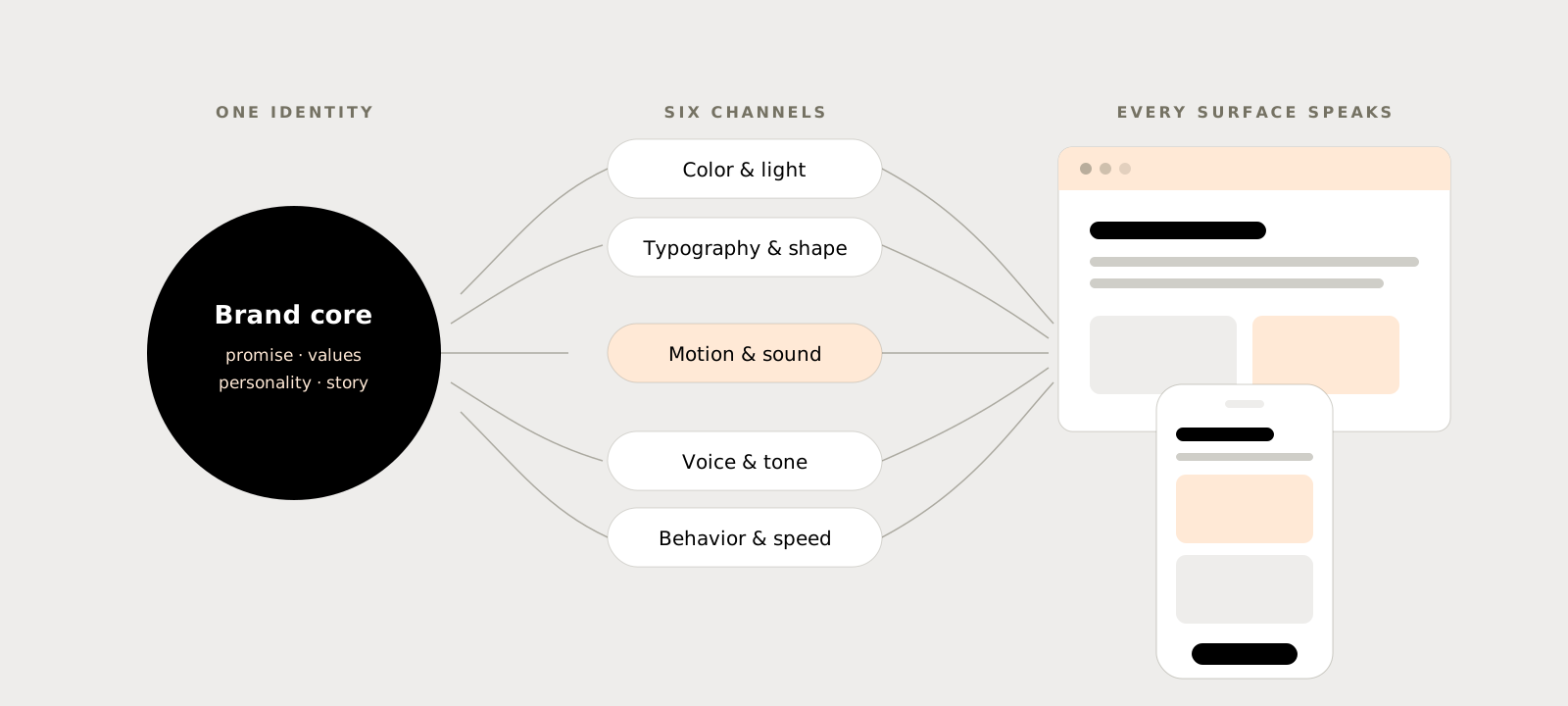
• Design six channels deliberately — color,
typography & shape, motion, sound & haptics, voice, and
behavior. Every product broadcasts on all six whether anyone is
steering or not.
• Encode the brand in the design system. Tokens,
components, and content guidelines are how a brand survives
contact with twenty contributors and three platforms.
• Counter-bullet: brand expression borrows
attention from the task. Every delightful flourish is a small tax
on usability — the craft is knowing which moments can afford it.
• Match ambition to stage. A first launch needs a
minimum viable brand it can keep consistent; an established
product needs continuity — evolve the equity, don't torch it.
Table of contents.
Every product already has a brand. Most teams just didn't design it.
The question that prompted this post comes up on almost every 0→1 project I've worked on: "we'll do branding later — can we just get the product out?" The assumption underneath is that branding is a coat of paint: a logo, a palette, a landing page, applied after the real work. But by the time a user has completed onboarding, hit their first error, and received their first notification, they already have a felt sense of who this product is — hasty or calm, precise or sloppy, warm or indifferent. That impression is the brand. The only choice a team gets to make is whether it was designed or accidental.
This post is for product designers and founders shipping web and mobile apps — especially small teams without a dedicated brand studio on call. It pulls together what the strongest consumer and developer products actually do, why it works, and how to apply it whether you're naming your first repository or stewarding a brand with millions of daily users.
For digital products, the interface is the brand's primary medium.
Classical branding was built for a world where the product and the message lived in different places: the car in the driveway, the ad on TV. Digital products collapse that distance. The place where people encounter the brand and the place where they use the product are the same screen. A user might see your logo for two seconds a day — they'll spend forty minutes inside your navigation, your empty states, your error messages, and your loading spinners.
Brand is the sum of interactions, not the assets
The working definition I use: a digital product's brand is the accumulated impression left by every interaction someone has with it — visual, verbal, behavioral. The logo, palette, and typeface are the identity system; the brand is what people replay in their head when your name comes up. That's why "brand" work that stops at a style guide so often fails to move perception: the artifacts changed, but the ten thousand interactions didn't.
Behavior is branding
The most underrated brand asset in software is how the product behaves. Linear's brand isn't its typeface — it's that every interaction feels instant, every default is opinionated, and the keyboard drives everything. The company wrote this down as the Linear Method: speed is a feature, constraints beat configurability, craft lives in details users never consciously notice. Users can't quote the method, but they can feel it. When a product's behavior and its visual identity say the same thing, the brand compounds. When they contradict — a "simple, calm" brand with a nagging, modal-happy interface — the behavior always wins.
"Users spend seconds with your logo and hours with your interface — whatever the interface says about you is what people will believe."
Six channels a brand speaks through inside a UI.
Every interface broadcasts on six channels simultaneously. The order below runs from the most obvious to the most neglected — which is also, roughly, the order of increasing competitive advantage, because the later channels are the ones competitors rarely bother to design.
-
01
Color and light
Color is the fastest brand signal on screen — it's read before a single word. Headspace's sunrise oranges make a mental-health app feel like warmth instead of a clinic; Spotify's black canvas with acid green reads as nightlife, not office software. The craft decision isn't picking a hero color — it's deciding the ratio: how much of the screen is calm neutral surface, and where the brand color is allowed to concentrate.
-
02
Typography and shape
Type and geometry set the product's posture. Stripe's tight, editorial typography says "we are precise with your money"; Duolingo's rounded everything says "mistakes are fine here." Corner radii, stroke weights, iconography style, and density are all one voice — a product that mixes playful blobs with sharp enterprise data tables reads as two companies wearing one trench coat.
-
03
Motion
Motion is personality over time. Duolingo built its characters in Rive so they react in real time to taps, answers, and streaks — the mascot is not a sticker, it's a behavior. On the other end, Linear's animation curves are fast and dry on purpose: nothing bounces, because bouncing would contradict the brand. Define signature easing, duration ranges, and which moments deserve celebration — then enforce them like tokens.
-
04
Sound and haptics
Netflix's "ta-dum" proves a brand can live in two notes. In-product, Duolingo's correct-answer chime and streak fanfare are as recognizable as its owl — and on mobile, a signature haptic pattern on success is a brand asset no screenshot can steal. Most products ship the platform's default sounds, which is exactly why designed ones stand out.
-
05
Voice and microcopy
Every string in the product is the brand talking — button labels, empty states, error messages, release notes. Mailchimp turned this into an industry-defining discipline with its public voice-and-tone guide: one consistent voice, with tone that flexes to the reader's emotional state. Voice is covered in depth in section 05, because it deserves it.
-
06
Behavior, speed, and defaults
What the product does under pressure is what users remember: how fast it opens, what it does with your data by default, whether an error costs you your work, how easy it is to leave. These decisions read as character — respectful or extractive, confident or needy. The outcome of designing all six channels together is a product that would still be recognizable with the logo removed. That's the test the next section builds on.
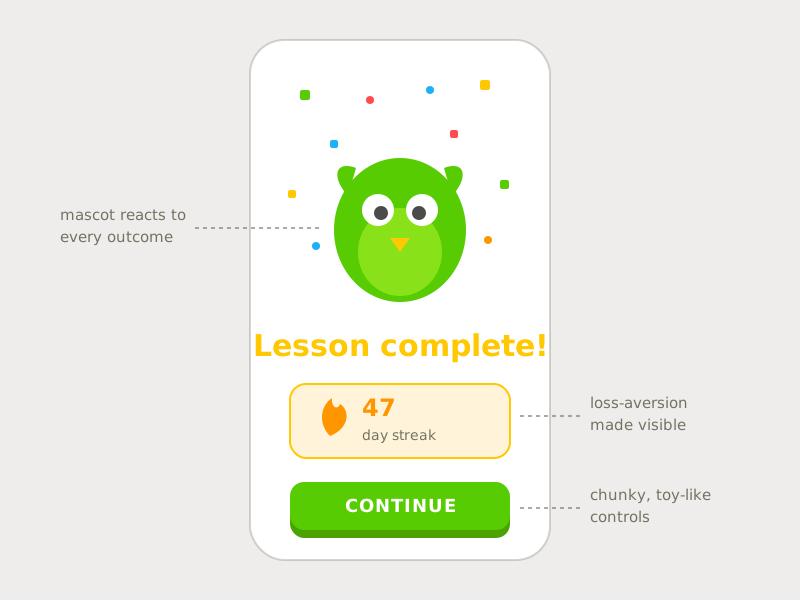
Schematic recreation of Duolingo's lesson-complete moment. Why it's good: the brand personality is load-bearing — the mascot reacts to your actual performance, the streak makes loss aversion visible, and the chunky, toy-like button turns "study" into "play." Remove the owl and the mechanics still work; remove the mechanics and the owl is just a sticker.
What the strongest product brands actually do.
Across the products this post studies, the same handful of practices keeps reappearing. None of them require a brand agency. All of them require someone deciding on purpose.
Encode the brand in design tokens, not in memory
A brand that lives in a designer's taste dies at the second hire. Colors, type scale, radii, spacing, elevation, motion durations, easing curves — name them, tokenize them, and make the components consume the tokens. This is how Airbnb's design language survives hundreds of contributors: the system, not the individuals, carries the identity. Tokens are also what make theming, dark mode, and white-labeling possible without the brand dissolving.
Keep a calm base; spend personality in chosen moments
The strongest interfaces are roughly 80% quiet convention and 20% concentrated character. Headspace's session screens are almost austere — the personality is spent on the home screen's sunrise header and the illustrated characters, so meditation itself stays undisturbed. Duolingo spends its exuberance on completion moments, not on the exercise UI. Decide where your product's "brand moments" are — onboarding, success, milestones, empty states — and let the rest of the interface get out of the way.
Respect platform conventions; differentiate in the seams
On iOS and Android, fighting the platform reads as broken, not branded. The products that feel most native and most distinct — think of how Things or Duolingo sit on iOS — keep navigation, gestures, and system patterns standard, and express identity through color, type, illustration, motion, and copy layered on top. Brand lives in how the conventions are executed, not in whether they're obeyed.
Treat quality itself as brand strategy
Stripe's brand position — the credible, craftsman-grade infrastructure company — is enforced less by its gradient than by the fact that its dashboard tables align, its docs read like a well-edited book, and its numbers are set in tabular figures. An entire generation of developer tools now imitates the "Stripe aesthetic," but the aesthetic was always downstream of the discipline. Fit and finish is the one brand claim that can't be faked in a style guide.
Make accessibility part of the brand contract
Contrast failures, tap targets that miss, motion that can't be reduced — these are brand damage, because they tell a segment of users the product wasn't built with them in mind. The practical rule: brand colors get tested against WCAG before they enter the token set, personality never overrides legibility, and every celebratory animation has a reduced-motion path that still feels considered.
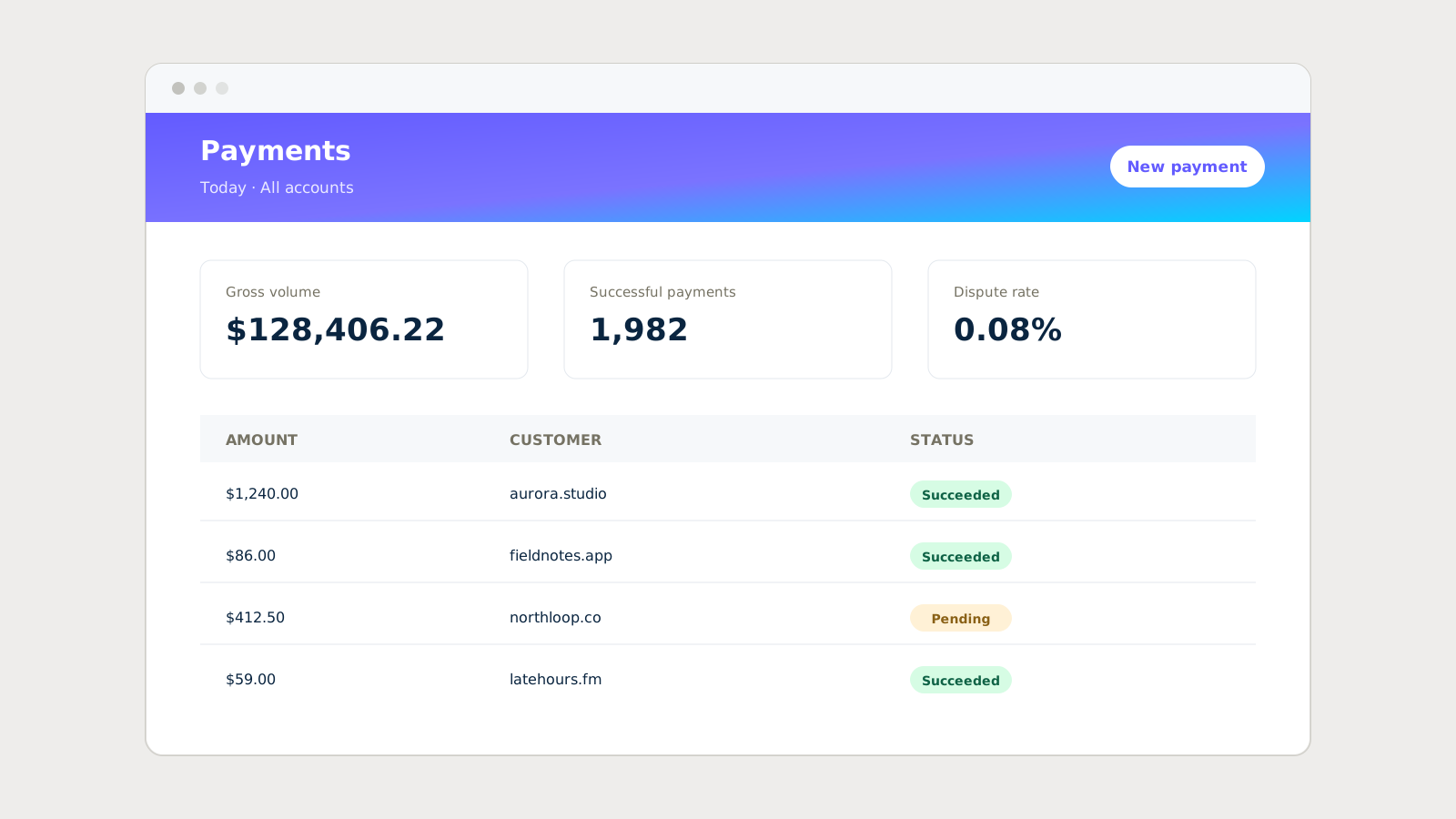
Schematic recreation of the Stripe dashboard pattern. Why it's good: the gradient is the only theatrical element on the page — everything below it argues for trust through precision: tabular monospaced figures, generous alignment, quiet status pills. The brand message ("we are exact with your money") is carried by typographic discipline, not decoration.
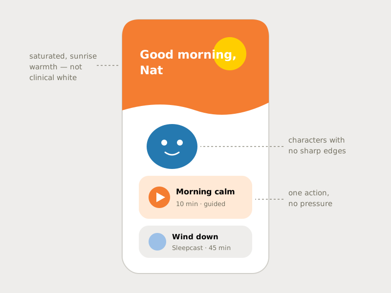
Schematic recreation of Headspace's home pattern. Why it's good: every choice lowers the threshold to begin — saturated sunrise color instead of clinical white, characters with no sharp edges, and one suggested session instead of a library dump. The illustration style is abstract enough that everyone can project themselves into it; warmth is doing functional work, not decoration.
Voice is who you are; tone is how you read the room.
The cleanest framework in the industry is still Mailchimp's: your voice never changes, your tone changes constantly. Voice is the product's stable personality — plainspoken, wry, expert, warm, whatever you choose. Tone is that same personality adjusting to the user's emotional state: playful in an empty state, brisk in a confirmation, calm and blame-free in a payment failure. A product that jokes in error messages hasn't got a strong voice — it's got a tin ear.
To make voice operational rather than aspirational, write three artifacts: voice adjectives with counterweights ("friendly but not chummy, expert but never condescending"), a tone map that lists the product's emotional hotspots — onboarding, success, waiting, failure, billing, goodbye — and how the voice flexes at each, and a string library of real, approved copy for the fifty most common moments. The third one matters most: engineers ship what's in the string file, not what's in the brand deck.
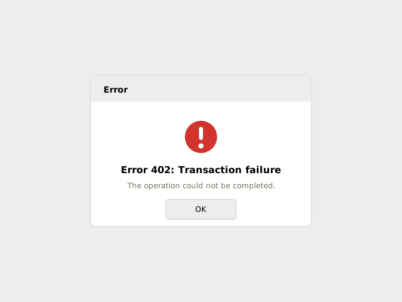
The same failure with no voice: a code the user can't act on, blame with no path forward, and "OK" — which it isn't.
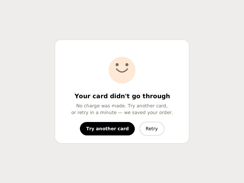
The same failure with voice: states what happened, removes the fear ("no charge was made"), and hands over two next moves. Same event — opposite brand.
Going to market for the first time vs. branding with a customer base.
Early stage: minimum viable brand, maximum consistency
Before product-market fit, an elaborate brand is a liability — the positioning will change, and every polished asset becomes sunk cost arguing against the pivot. What an early product needs is a minimum viable brand: a name you can own, one typeface, one accent color on a neutral base, a one-page voice guide, and a small token file — all applied with fanatical consistency. At this stage, consistency does the work that fame does for big brands: a tiny product that never contradicts itself feels far more trustworthy than its size deserves. Spend the savings on the two moments that decide perception — onboarding and failure — and defer mascots, sonic logos, and illustration systems until the personality has been validated against real users.
Established: you're not painting a canvas, you're renovating a home people live in
A product with a customer base has brand equity — accumulated recognition, muscle memory, and trust — and the first rule is to audit it before touching anything: what do users actually recognize you by, and what would they defend? Evolve around those anchors. Rebrands at this stage are exercises in continuity: migrate gradually behind tokens and feature flags, sequence changes so navigation muscle memory survives, explain the "why" in-product, and expect a vocal adjustment period regardless. The risk profile also inverts: an early product's danger is being forgettable; an established product's danger is breaking what people already love. When in doubt, refresh the expression and keep the bones.
A brand is strong when the product would still be recognizable with the logo removed — by its color ratio, its type posture, its motion, its voice, and how it behaves when something goes wrong.
Creating a new digital product brand — what to decide, in order.
A working checklist, ordered so that each decision feeds the next. Strategy first — everything visual is downstream of it.
Creating a new product brand — the actions, in order.
The checklist above tells you what to decide; this is the sequence to do it in. Each step produces an artifact the next step consumes, so nothing gets designed before the thing it depends on exists.
-
01
Write the brand core on one page
Draft the four lines — promise, values, personality adjectives with counterweights, and the enemy — and get the founding team to sign off on the actual words. Output: a one-pager every later decision can be tested against.
-
02
Audit the category's codes
Screenshot the five products your users will compare you to and list the conventions they share — palettes, tone, iconography, density. Decide explicitly which codes you'll keep (so you read as legitimate) and which you'll break (so you read as different). Output: a keep/break list.
-
03
Name it and clear it
Shortlist names, then run the boring checks before falling in love: trademark search in your key markets, domain and app store availability, pronunciation by non-native speakers. Output: a name you can legally and practically own.
-
04
Design the identity kernel
Mark first at 16 px (favicon, app icon), then scaled up. One accent color on a neutral system, contrast-checked before adoption. One or two typefaces, licensed for app, web, and marketing in the same purchase. Output: the smallest set of assets that can carry the brand.
-
05
Encode it as tokens and components
Turn every kernel decision into named design tokens — color, type scale, radii, spacing, motion durations, easing — and build the core components on top of them. Include dark mode now, not later. Output: a token file and component library that make the brand the default, not an act of discipline.
-
06
Write the voice guide and string library
Voice adjectives with counterweights, a tone map for the emotional hotspots, and real approved copy for the fifty most common strings — errors, empty states, confirmations, onboarding, notifications. Output: a string file engineers can ship from directly.
-
07
Design the brand moments
Pick the handful of moments where personality concentrates — onboarding, first success, failure, milestones — and design them with full attention: motion, sound or silence, copy. Keep the rest of the interface calm. Output: the 20% of screens that do 80% of the brand's work.
-
08
Test the perception, not the taste
Run the logo-removal test on real screens, then ask five target users to describe the product's personality in three words. Compare their words to your adjectives from step 01 and fix the contradictions — in the product, not the deck. Output: evidence the brand you claim is the brand you ship.
-
09
Ship, then govern
Give the system an owner, set the review ritual for new colors, components, and copy patterns, and calendar a twice-yearly audit against the one-pager. Write down what may evolve and what is anchored. Output: a brand that survives growth instead of dissolving into it.
Where brand expression breaks.
The limitation first: brand expression borrows attention from the task, and the loan always comes due. Duolingo-level personality works because the product's job — daily practice — benefits from emotional attachment. Put the same exuberance in a tax-filing or incident-response tool and it reads as unserious exactly when the stakes are highest. The more consequential the user's task, the quieter the brand should get; utility products should spend their personality budget in the margins (onboarding, empty states, release notes), never in the workflow itself.
Three more failure modes worth naming. Delight decays: the confetti that charmed on day one is furniture by day thirty and an irritant by day ninety — design celebrations to scale down with familiarity. Trend-borrowed identity ages fast: a brand assembled from this year's gradient and mascot template will look like this year forever; distinctiveness that isn't rooted in your own strategy is a countdown timer. And motion, sound, and illustration all carry costs — performance budgets, accessibility paths, localization of voice across languages — that a style guide never shows. If the team can't maintain a channel, not designing it is the more on-brand choice.
"You have the same voice all the time, but your tone changes."
Audit one channel this week.
Here's the experiment worth trying: open your product, cover the logo, and walk the six channels — color ratio, type posture, motion, sound, voice, behavior under failure. Write down what each one currently says about you, in one sentence, as a stranger would put it. Most teams discover that two or three channels are saying something they never chose. That gap between the brand you claim and the brand you ship is the highest-leverage design work available — no rebrand required.
A personal note: I used to treat branding as the thing that happened before the real design started — the deck you make so stakeholders let you build. Working on 0→1 products changed that. The brand deck was never the brand. The error message was.
"A strong product brand is one you'd still recognize with the logo removed."